Modeling & Materials

Weekly Activity Template

Alexander Yanque-Monge: Modeling and Space


Module 2


For this module, I explored spatial technologies and researched theories such as architecture, environment, and landscape psychology. I made an effort to study the spaces around my college, and how they relate to the theories I researched. From here I made a point to brainstorm, coming up with ideas and changes that I think could enhance the spaces around my college, falling in line with these principles I've learned.

Design Challenge 1
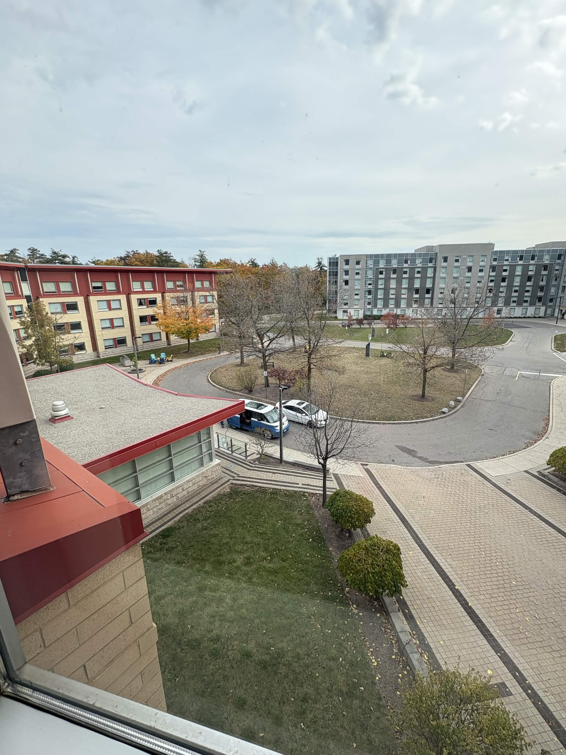
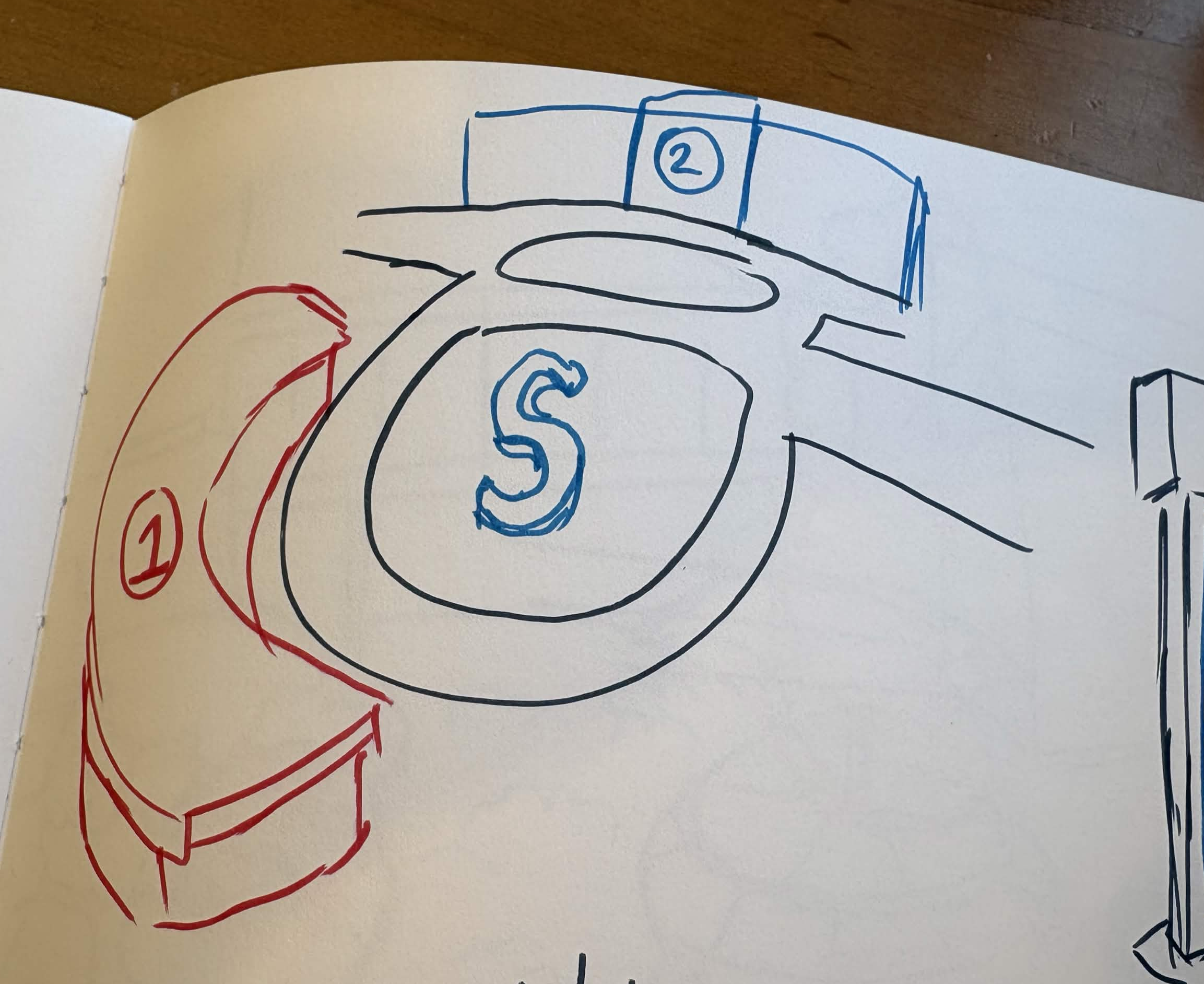
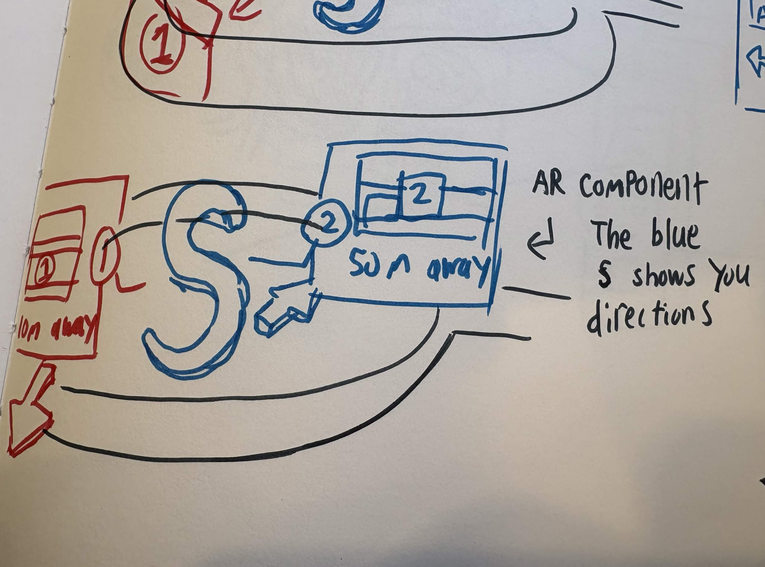
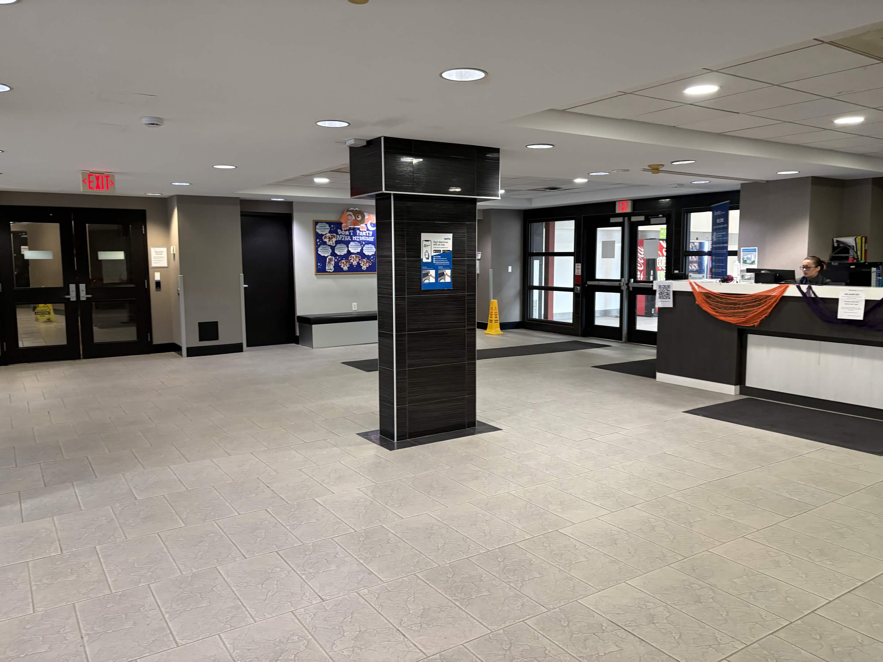
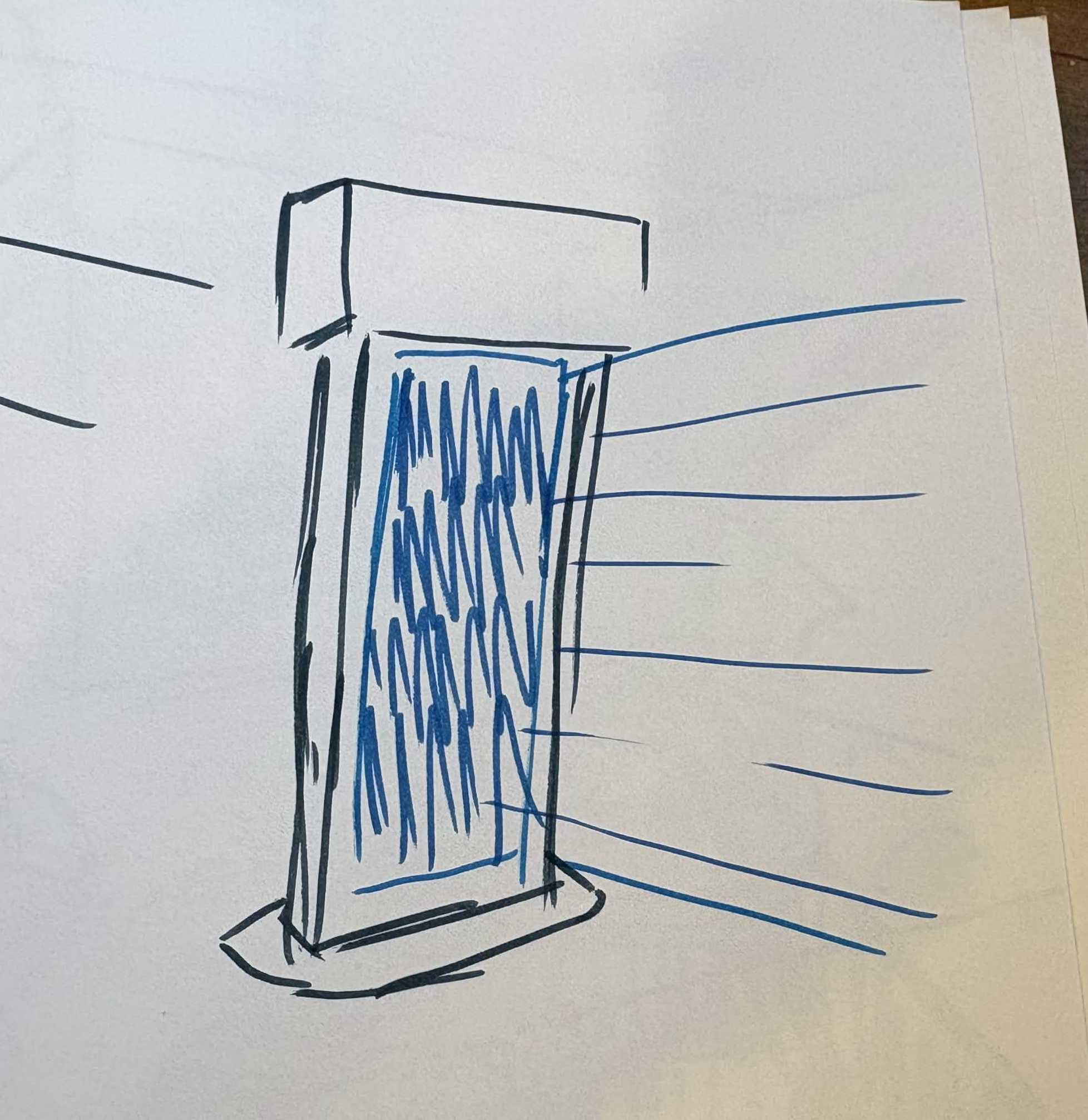
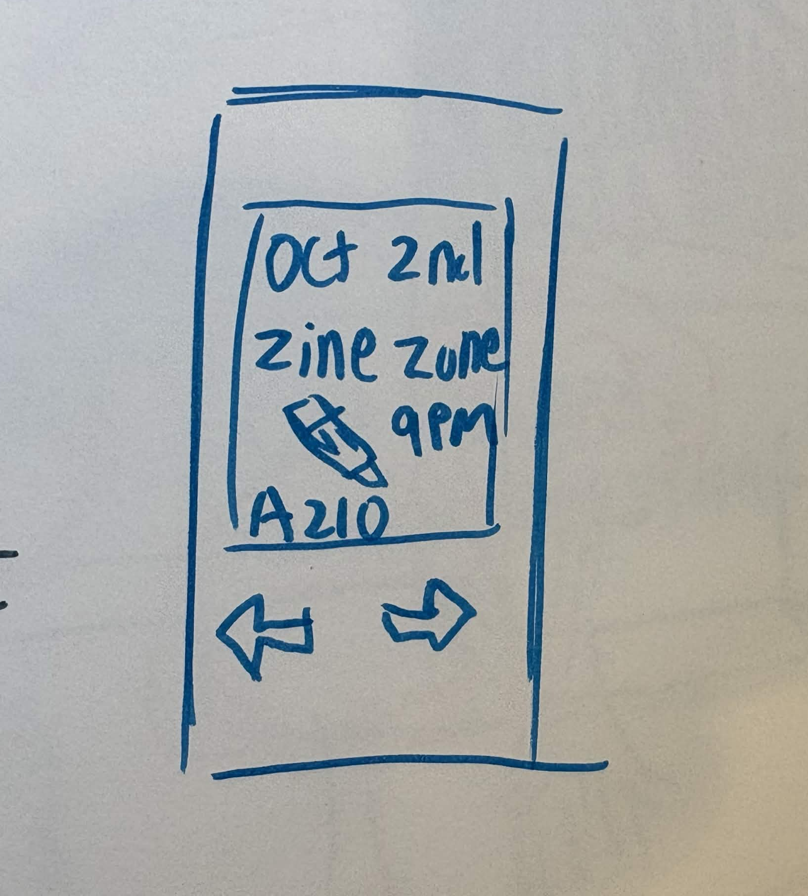
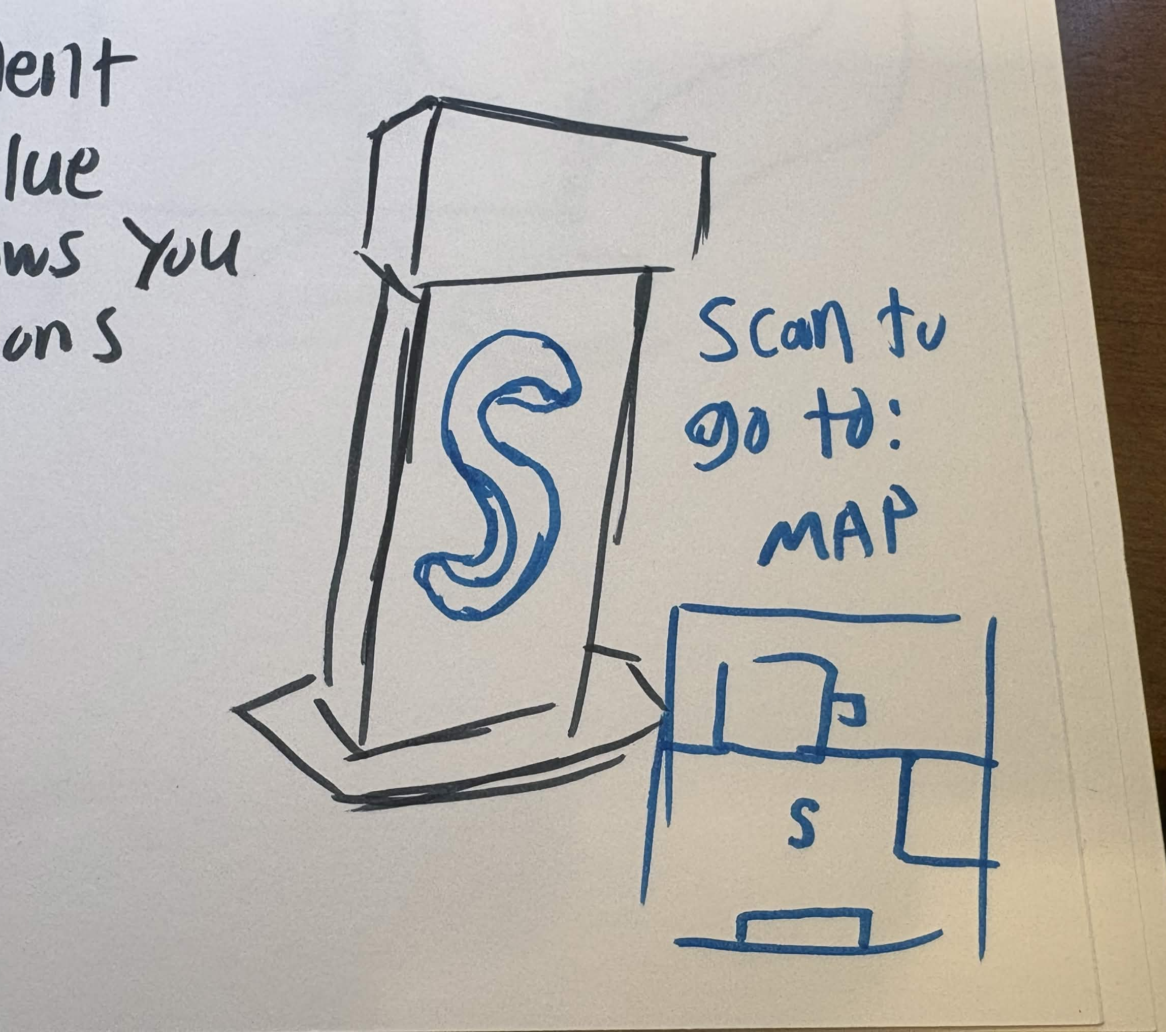
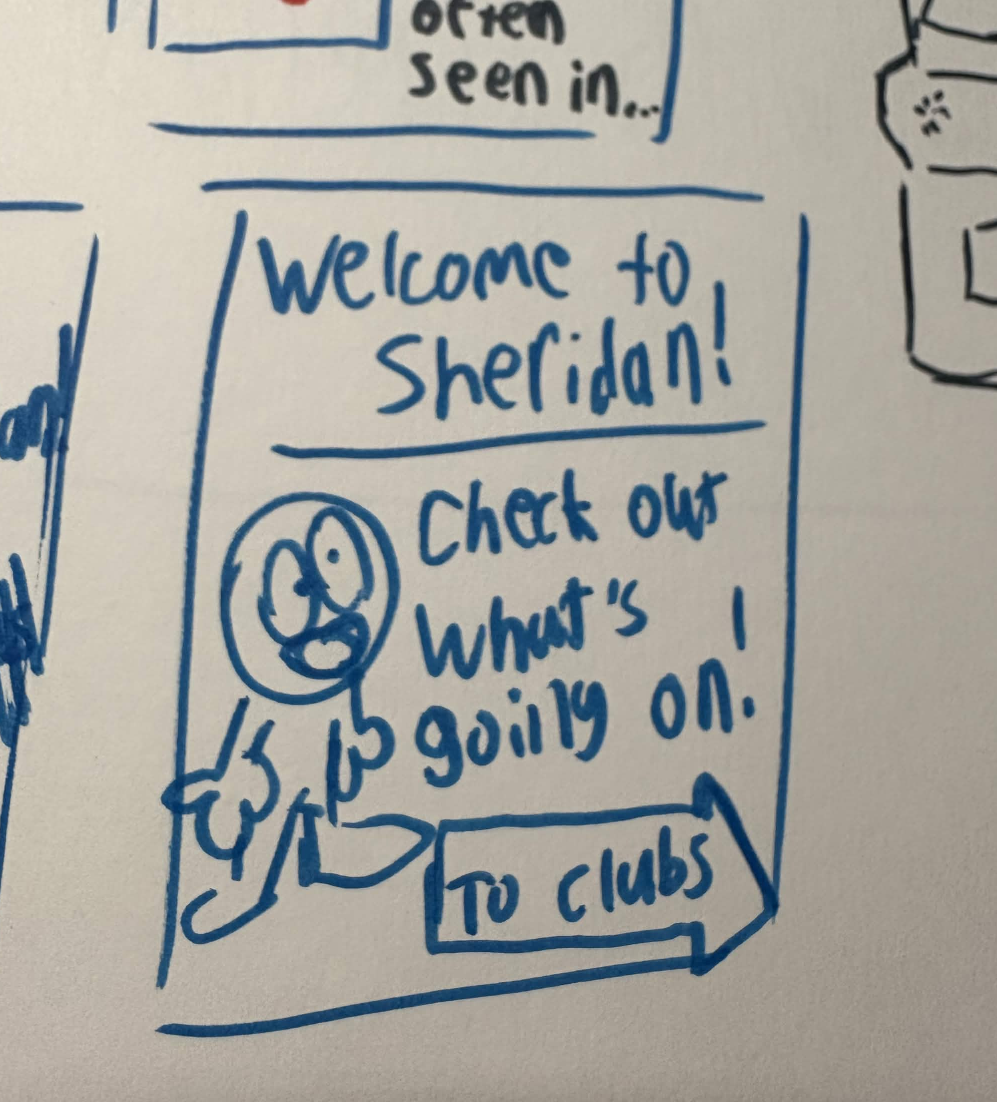
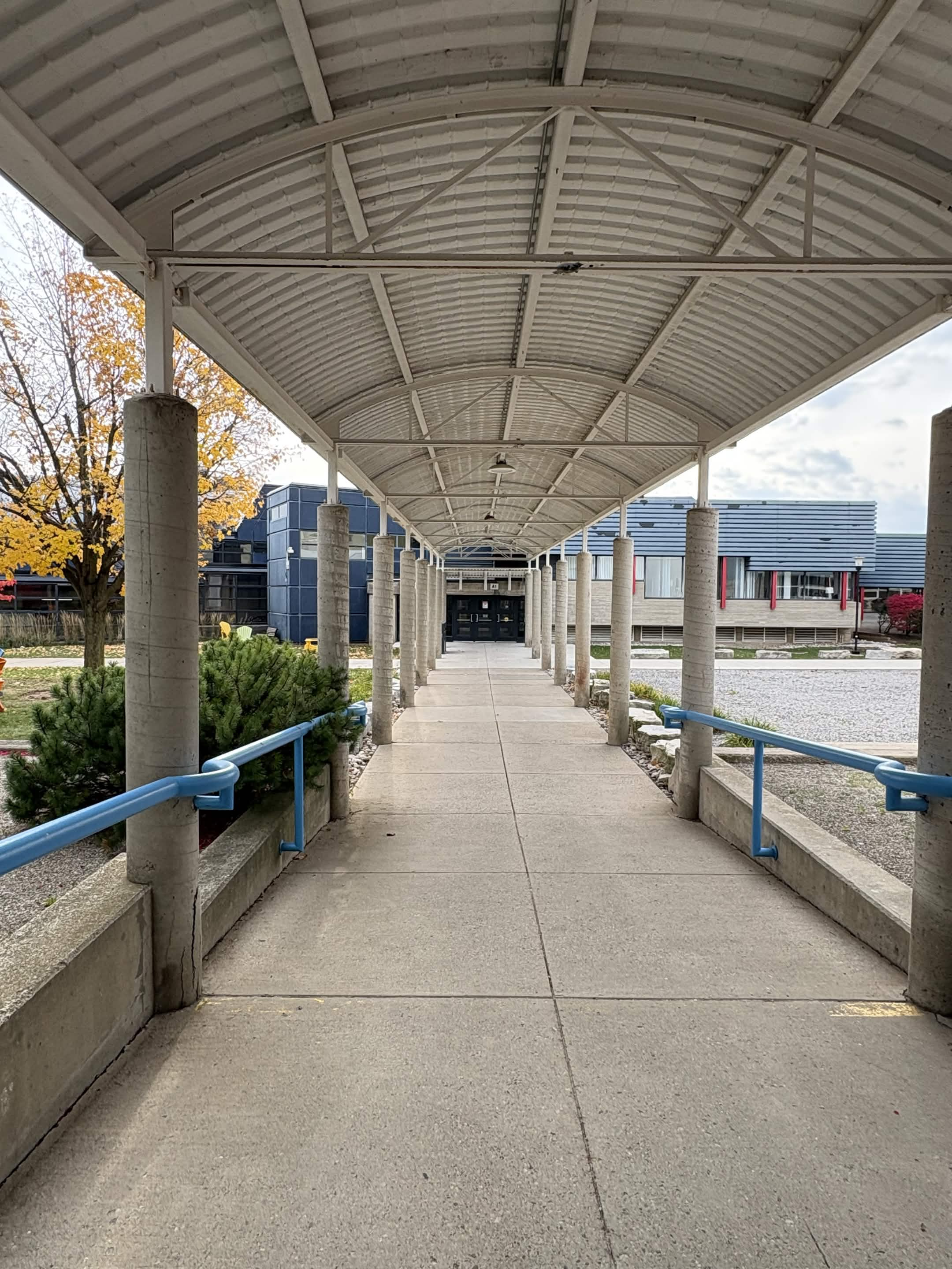
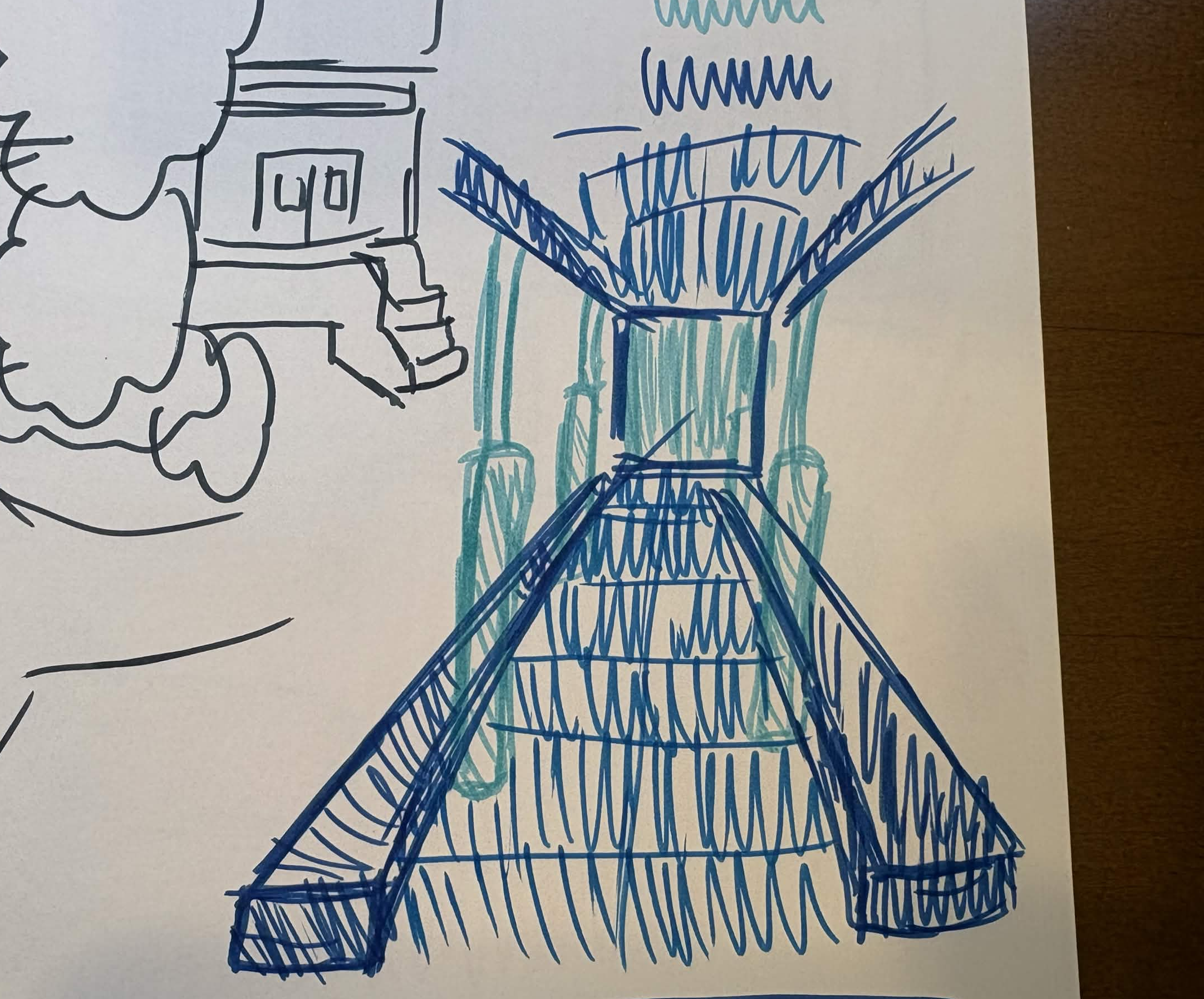
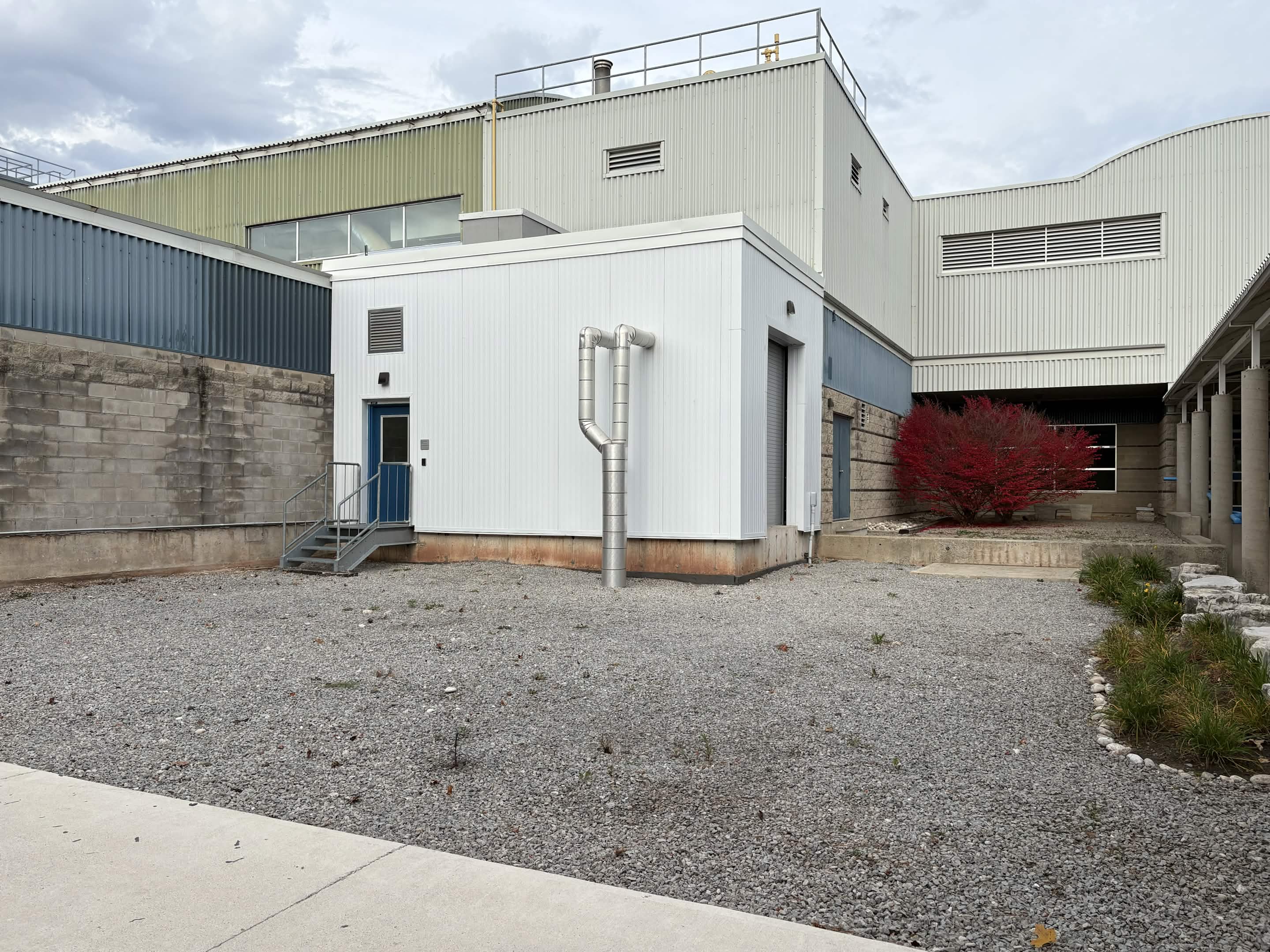
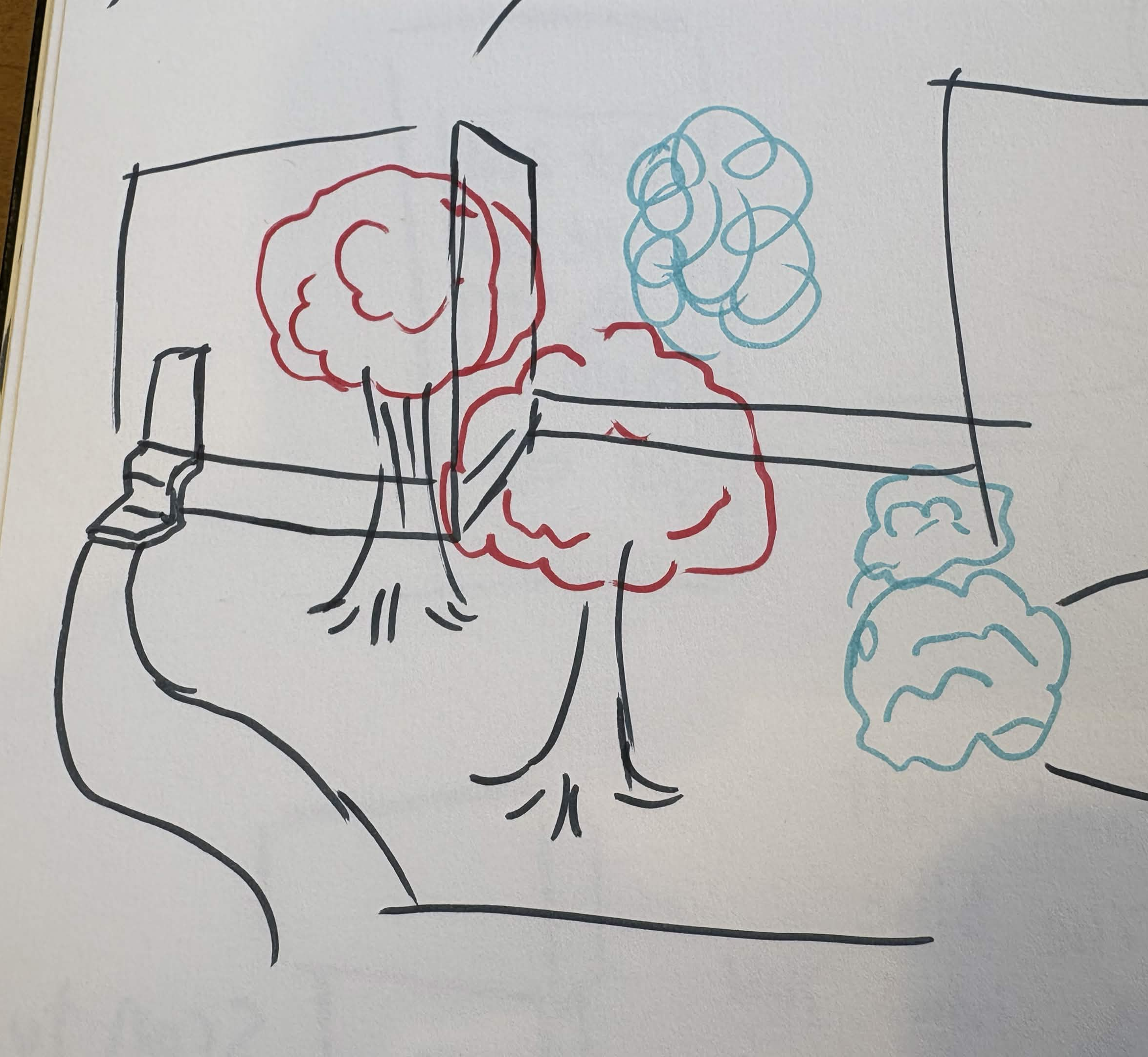
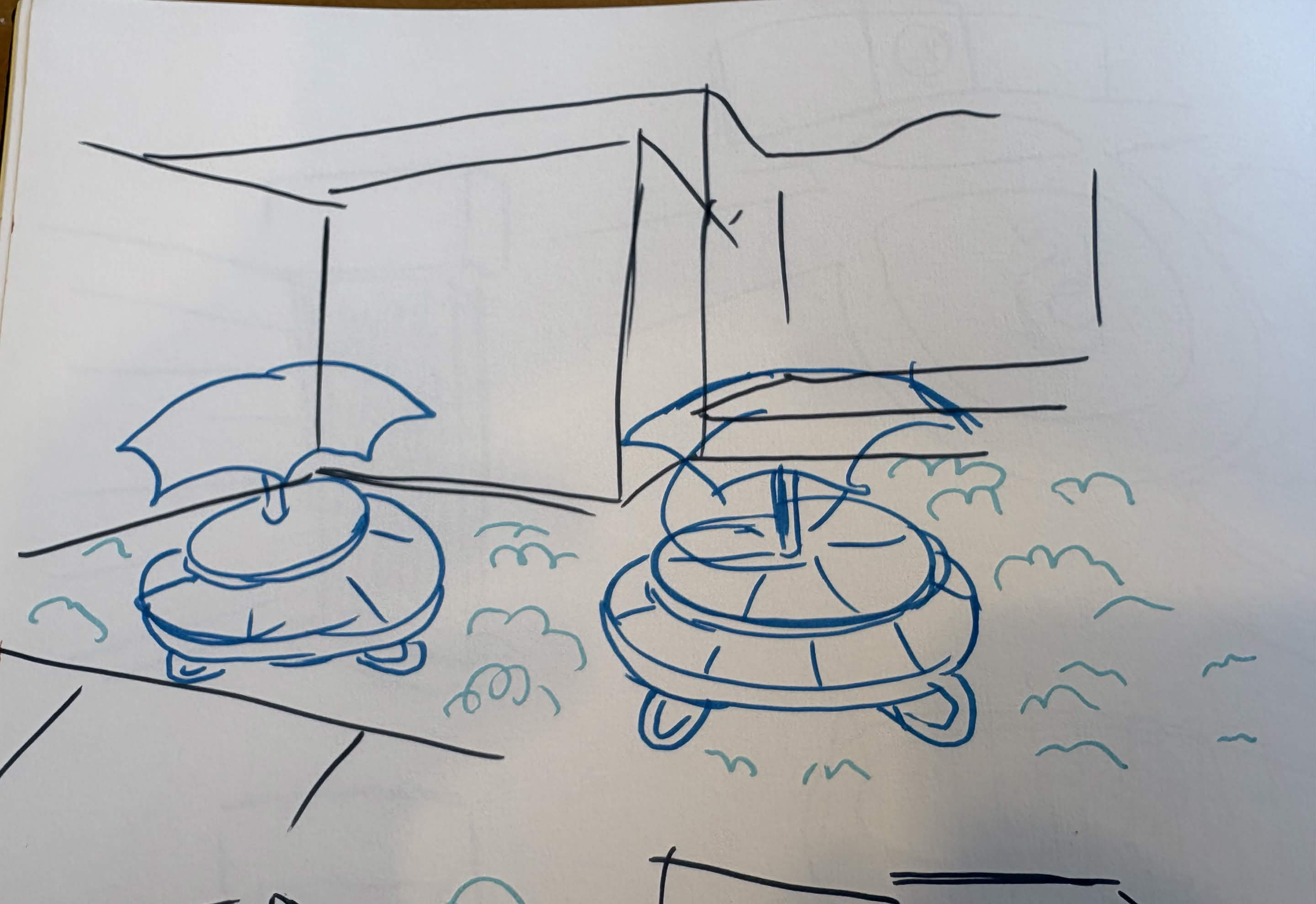
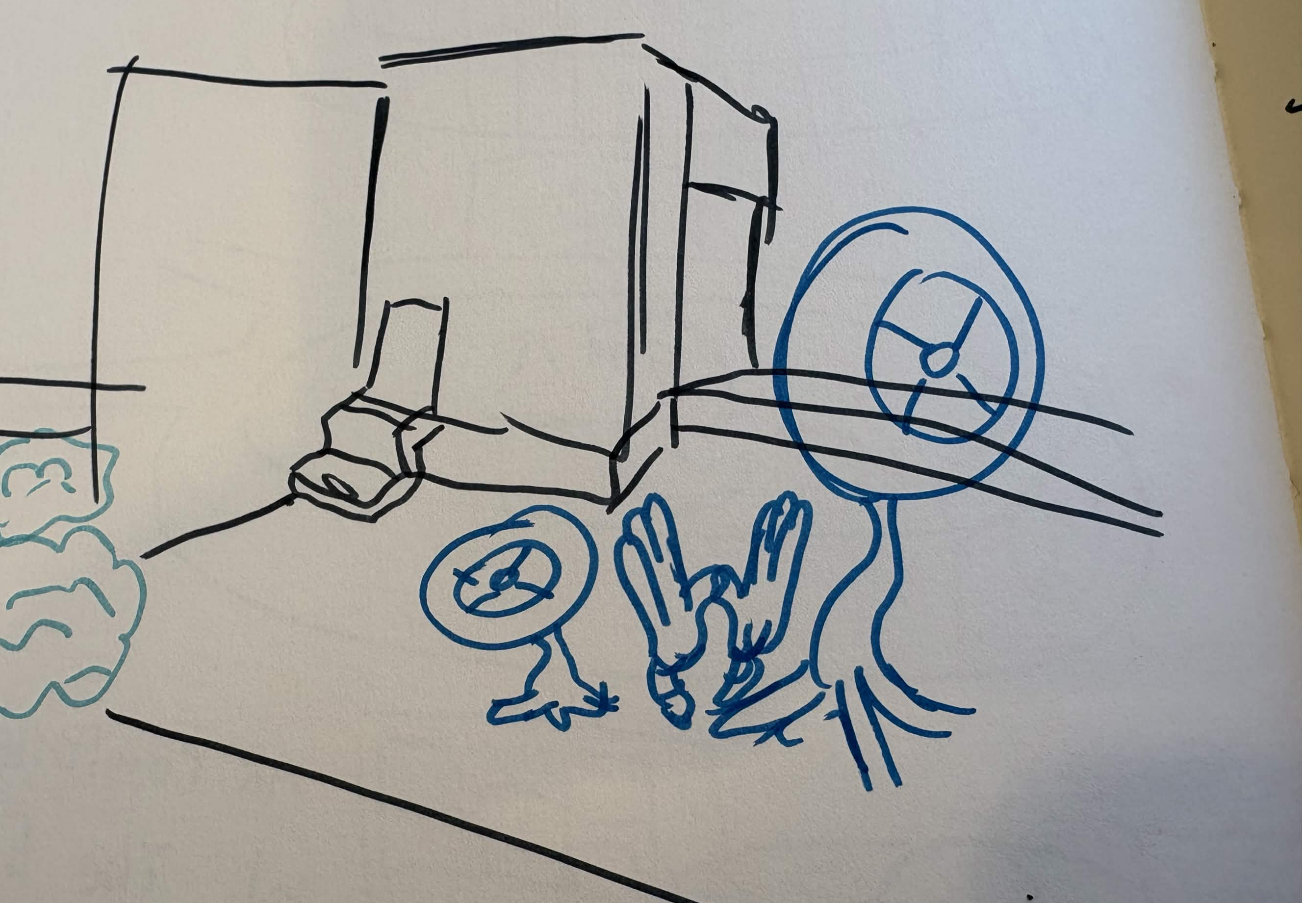
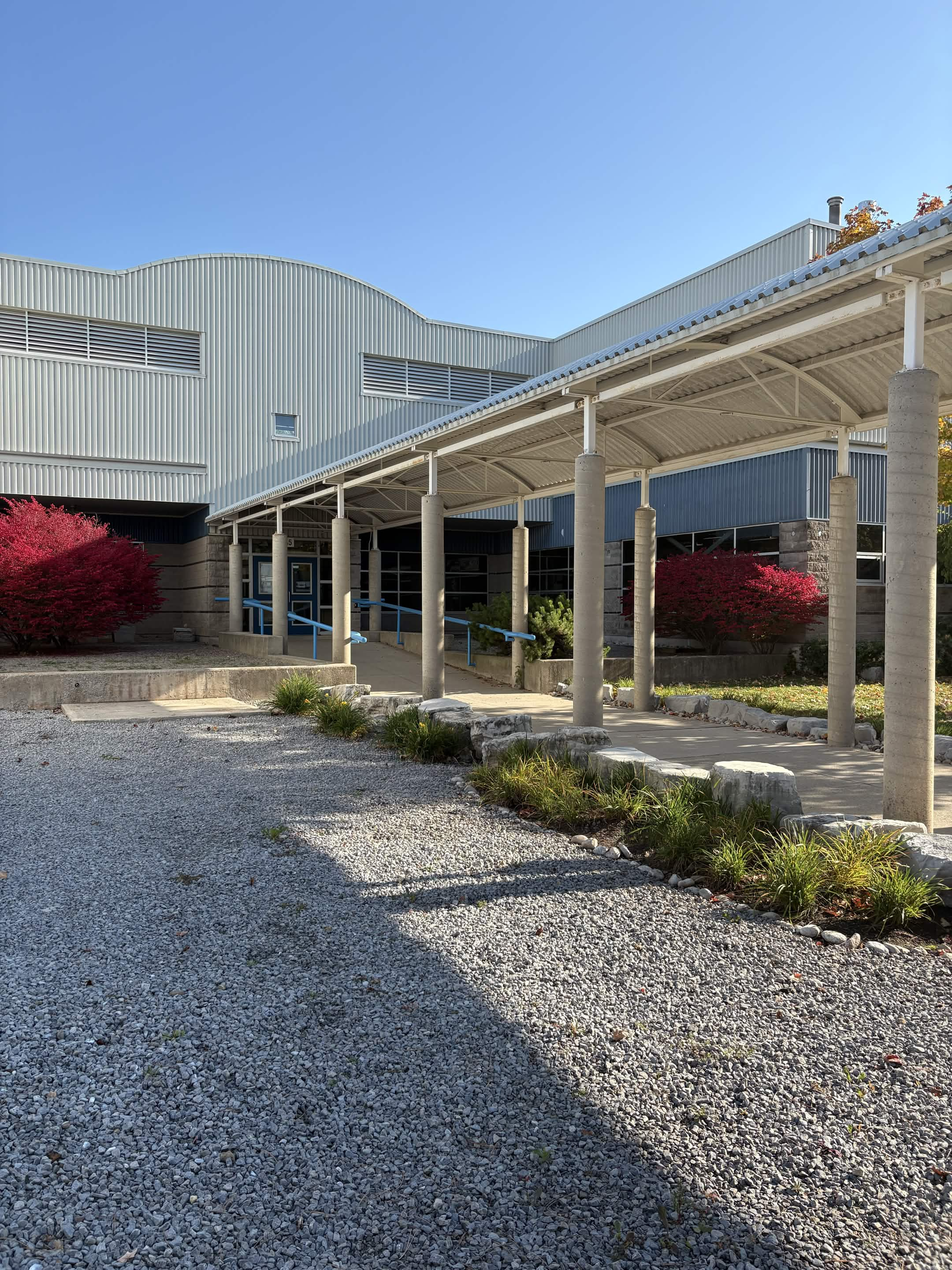
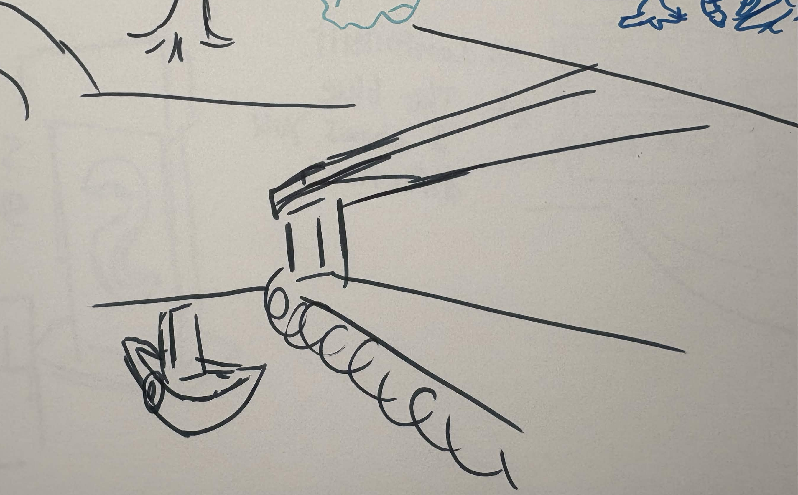
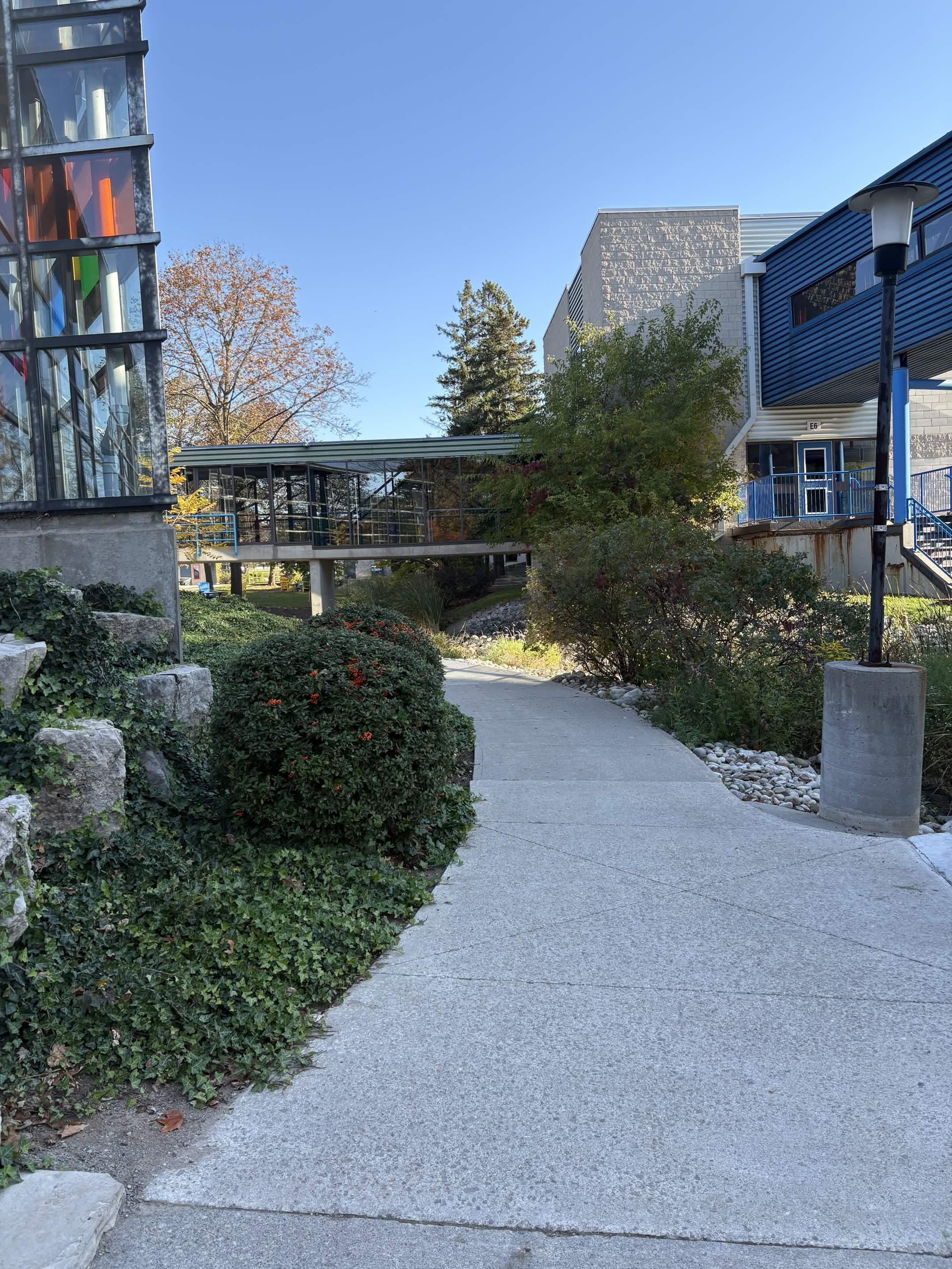
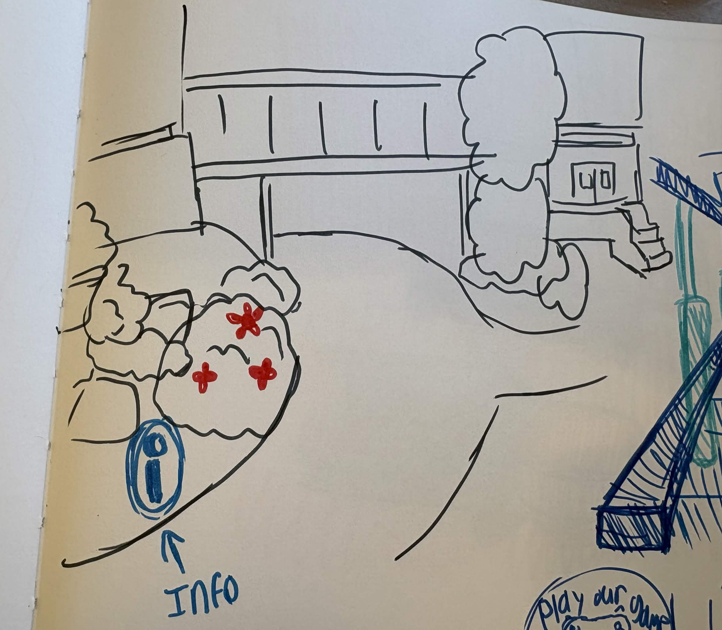
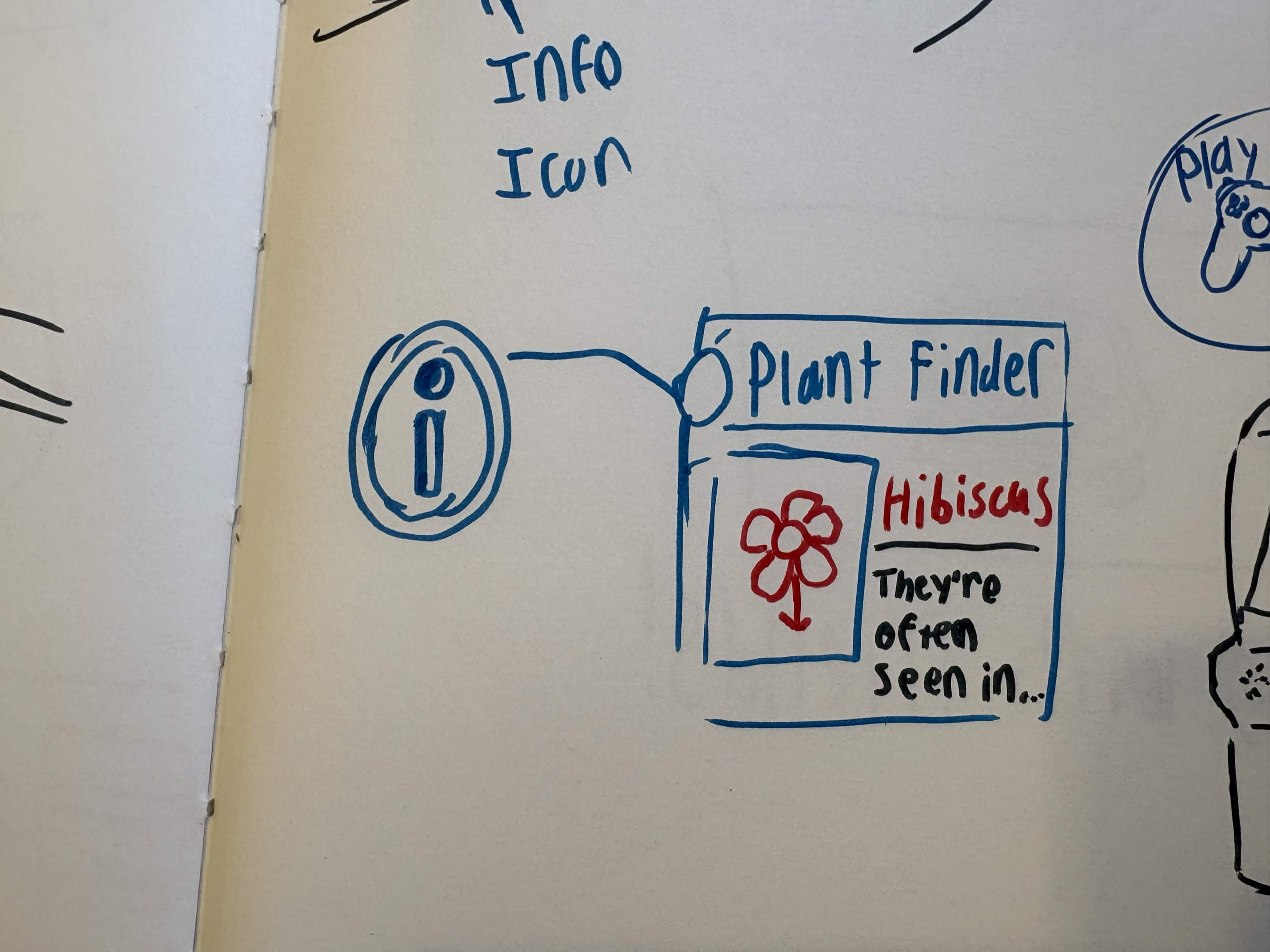
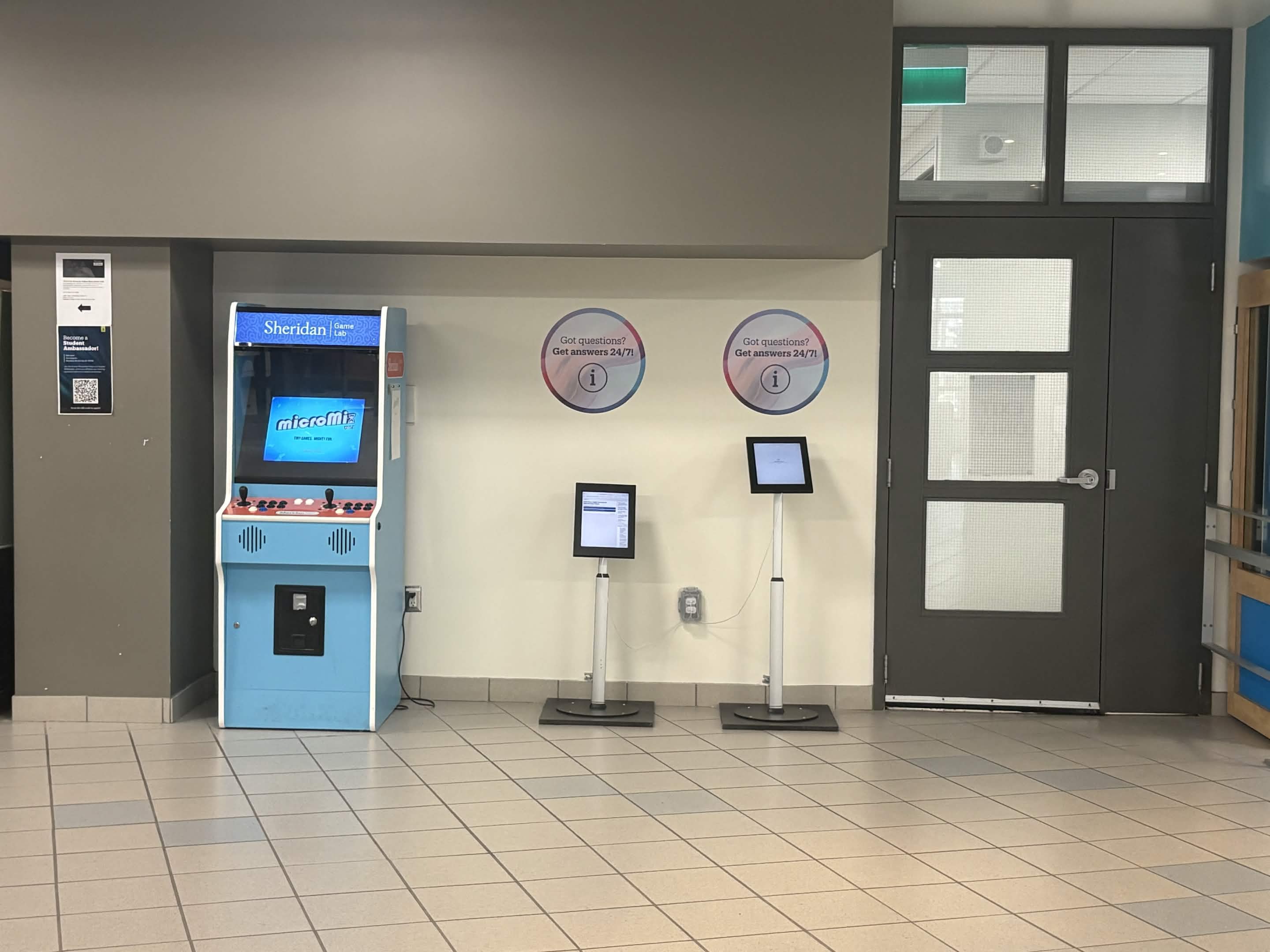
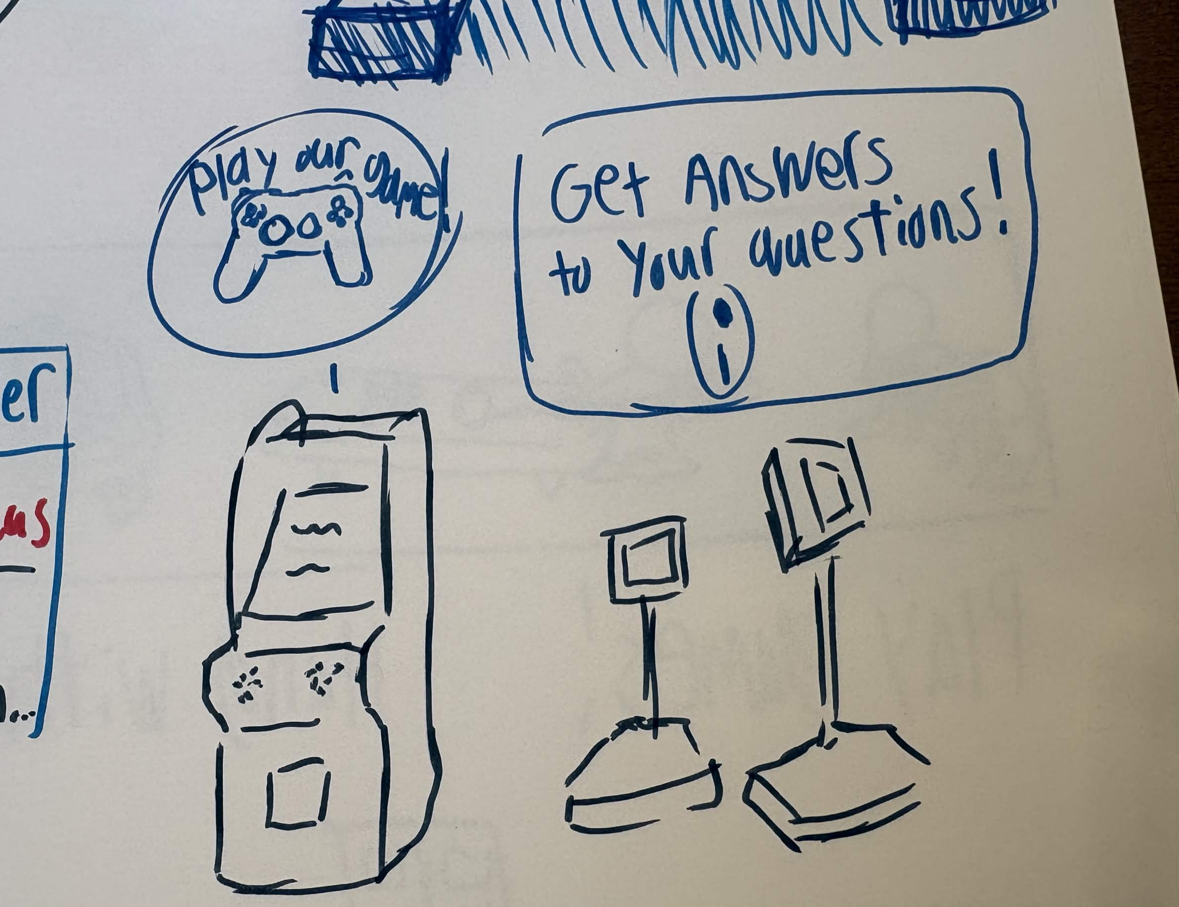
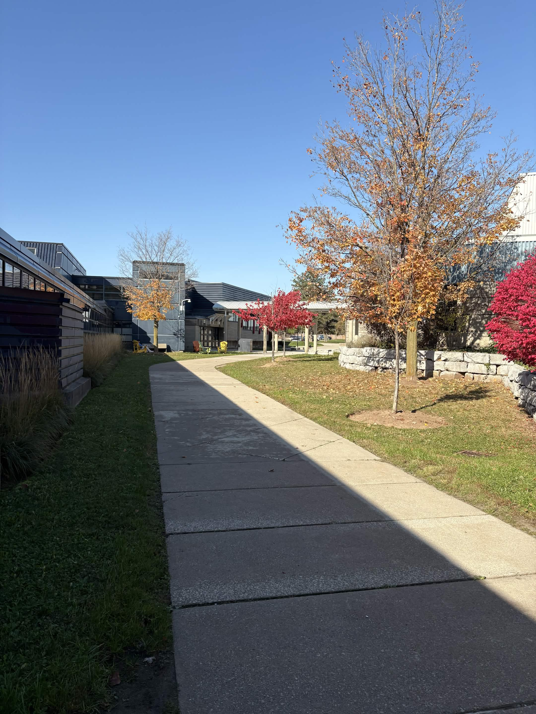
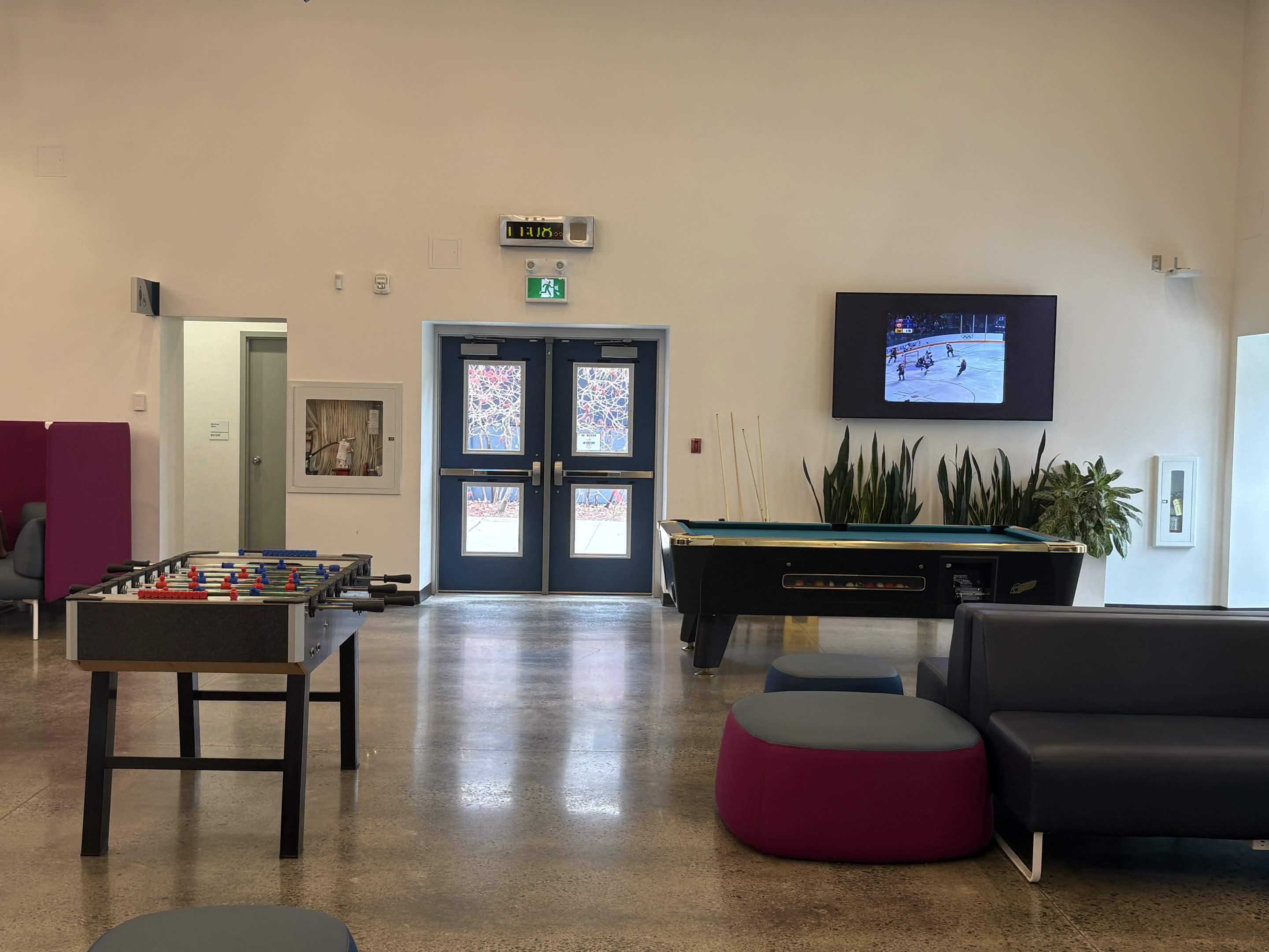
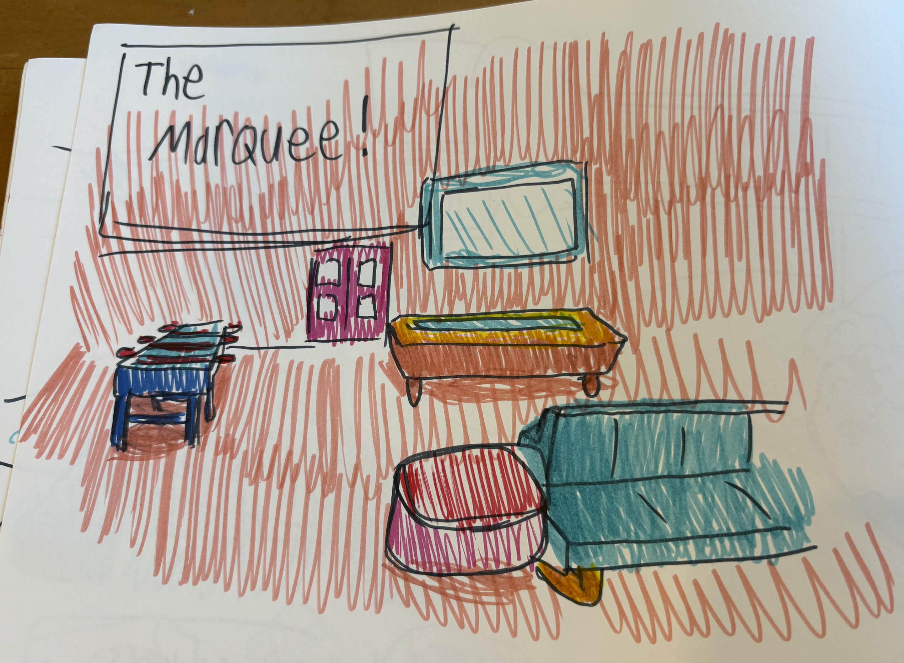
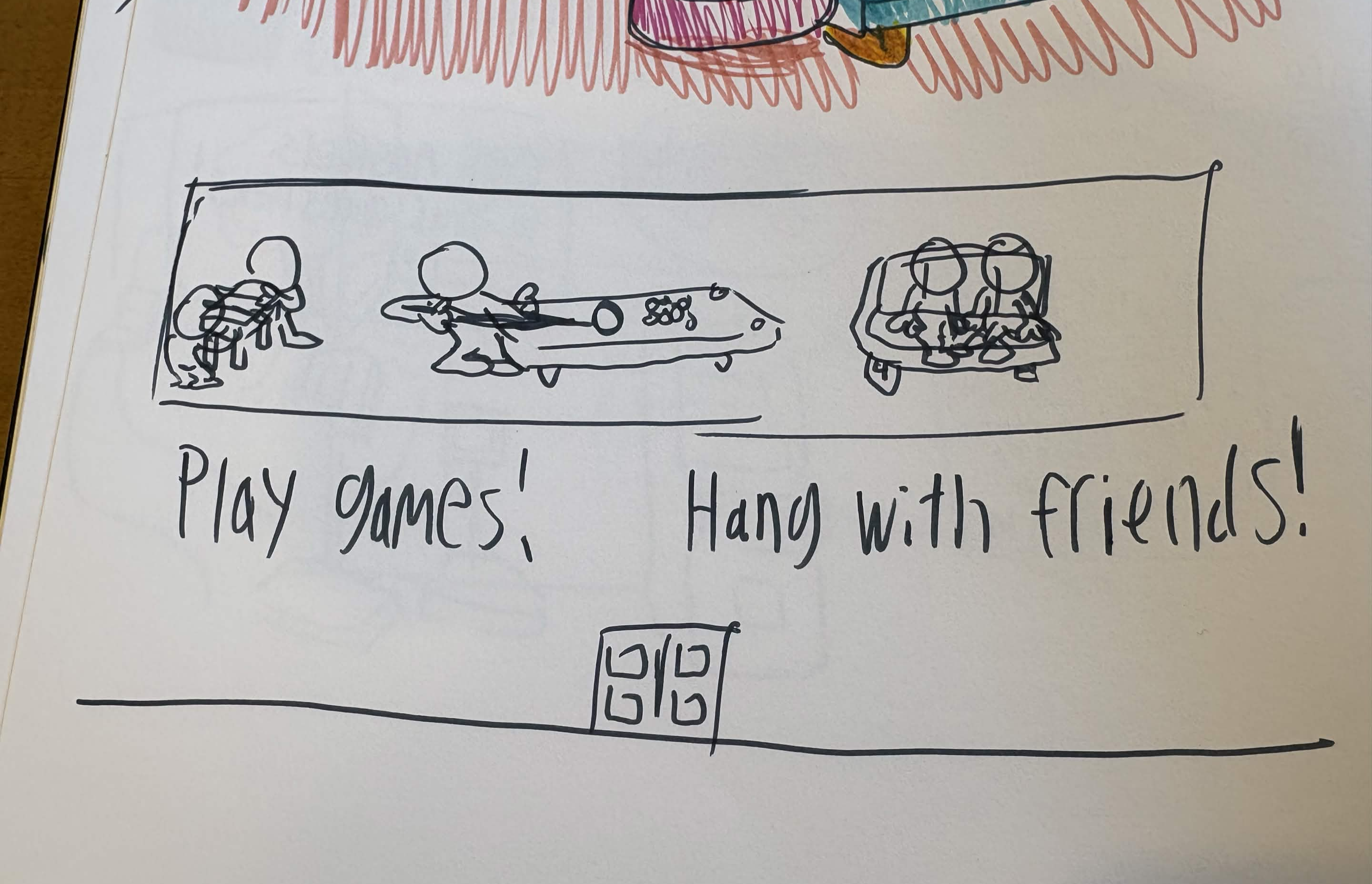
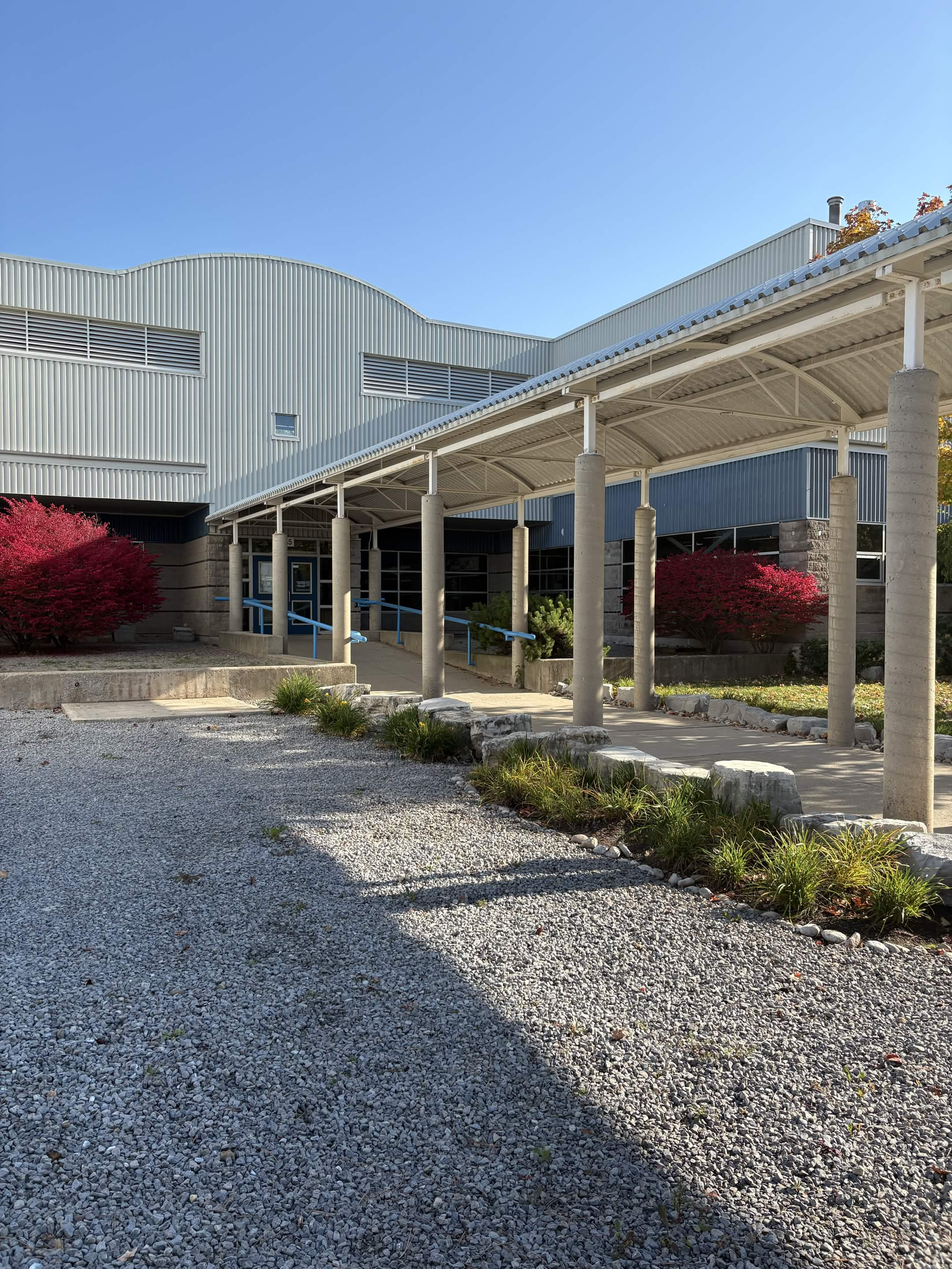
This view from outside the Residence 1 building shows this nice view of the roundabout and surrounding buildings. The warm colours of the residence 1 building are very cozy and inviting, while the cooler colours of the residence 2 building are more modern and sleek, fitting as the building itself is newer. I think this could be good potential for a lazer cut map of the area, which a very clean layout and a nice contrast of warm and cool colours. For this map, I decided to make sure that there's a clear contrast between the warm and cool colours of the two residence buildings, using colour to help guide the user around the area. I would add an S logo in the center of the roundabout for visual interest. In the center of the map, I'm thinking there could be an AR component, where if you scan the giant S in the center of the roundabout, it will spawn directions to certain locations around campus. Details will be shown such as name of location, distance, and estimated time to get there. Arrows could be shown that point to the buildings, with the user following the arrows to get to their destination. Looking at this residence lobby, I think there's potential for projector mapping with the column here. There isn't anything on it besides a singular poster, so why not have it display a range of community events and activities? It could play a rotating series of event posters, updated weekly. There could also be an AR component, maybe have a floating S symbol to represent the school, and when you scan it with your phone, it takes you to a page showing a map, and all the upcoming events and activities. This is how I envision the projector mapping to look like, beaming onto the column and making prominent use of all the space. I'm thinking maybe there's a way where you can scan the column with your phone, and your phone screen will then show all the events. It can then let you manually scroll through them. Exploring other possibilities, maybe the column could show a map when scanned, and instead of projector mapping there's simply an S logo there. Continuing on from my previous idea for the roundabout, the S logo could be used throughout the entire campus as a way to scan and check for maps. When you open up the screen on your phone, maybe you could also explore all the clubs on campus, manually browsing through them. This path to the A wing is very clean and practical, being a means to connect the two buildings despite the distance. It gives a clear sense of direction, and provides weather protection from rain and snow. Aside from the blue railings, the colours are quite plain, could benefit from having more colour to bring life and visual interest to the area. This was definitely made with architecture psychology in mind, above all else, with focus on practicality and functionality rather than aesthetics. Having more vibrant blue colours would make the area feel more exciting and evoke creativity, fitting as these buildings contain the art pit and 3d printing labs. Looking at this rough mockup I drew, I think there could probably be more white as well, to add more contrast, and reflect the main colours of the school. Exploring more of the A wing, I noticed that there seems to be a trend in the spaces surrounding it. The spaces are very open, but contain very little to look at. The spaces are practical, but not visually interesting. If we want students to feel more welcomed and excited to go to their classes, there could be a more expressive colour palette, and a way to make use of that open space filled with pebbles. Aside from greenery, there could be room for a small seating area, or even a small art installation. In this sketch I added trees and plants to fill up this open space, which already makes it look and feel less bleak. I do think maybe the trees are obstructing the view of the building too much, maybe just plants and bushes would be better. I also sketched out another idea, if we just added patio tables and chairs, on top of a grassy plane. This would make the area a good casual hangout spot for students, but I do wonder how often it would be used, as this particular area doesn't have much foot traffic. Now for this sketch I tried to experiment a bit more, wondering how an art installation would look in this space. I came up with a surreal sculpture idea with these weird alien-like plants growing out of the grounds, with a couple hands sticking out. I think this falls in line with the idea of inspiring creativity, and would be a good way to make the area more visually interesting. I also noticed the one side of this path has trees and decorative plants, while the other side feels very empty, only really containing pebbles and a few small plants. This would be a good opportunity to add more greenery to the area, and not make one side feel more welcoming than the other. I thought this would be fitting, adding an art installation of a 3d boat model. This would be because of the 3d printing lab being in the AA wing, where students typically print out these boat models as an introduction to the process. This would be a creative way to help showcase what students can expect to see in the labs at this building. Another example of very nice scenery, the view dominated by plants and trees, and a curving path that takes you on a walk through the area. This would be a good place to include a plant finder, where you can scan the plants and trees around you to learn more about them. Expanding on the plant finder idea, I think it can be represented through AR with an i symbol floating above the plants. When the user scans the symbol, they will get to see information about the plant. I did another quick mockup expanding on the plant finder feature, and designed a very quick screen of what the user would see when scanning the i symbol. The screen would show the name, and brief description, and a link to learn more about the plant. This part of the B-wing I find interesting, in this space we have an arcade machine, next to a couple help kiosks. This is interesting as the arcade seems to kind of take priority over the help kiosks, as the kiosks are these little stands that are easier to miss. I think there could be ways to draw more attention to the kiosks, as they're the more useful of the two. I think that while there isn't much to change the tablets to make them more prominent, maybe just larger signage would help draw attention. There's already two smaller signs, why not just one large one instead? This scenery is one of my favourites from around the college. The colours are inviting, the trees and greenery are very welcoming, the path is functional and takes you on a nice walk that isn't just a means to get from point A to point B, it all works. This is landscape psychology at its peak, and it does a great job at making the most out of nature. There is small traces of environmental psychology, with the chairs and tables in the distance, but perhaps there could be more of that. The Marquee is an interesting spot. Here we have this large social space for students, with games and large tables for students to socialize at, but it appears very formal and sterile. I think through colour alone we can make this space more vibrant and exciting, especially if this is a place where concerts and large social events are held. I worked on the colours and already I saw massive improvements, with no need to change the layout or structure of the space. The more vibrant colours make the space feel more reminiscent of an arcade or a carnival, which is fitting as this is supposed to be a casual social space for students. I was thinking about projectal mapping and how it could improve this space, and I thought it could help fill up the empty space on the walls by having animations and motion graphics projected onto them. Animations could include students playing the games, socializing, and partaking in events. I could also go in a more abstract direction and have more surreal shapes and patterns projected onto the walls, simply to add visual flair and control the mood of the space.

Design Challenge 2

put a description here or you will lose grades put a description here or you will lose grades put a description here or you will lose grades put a description here or you will lose grades put a description here or you will lose grades put a description here or you will lose grades put a description here or you will lose grades put a description here or you will lose grades put a description here or you will lose grades put a description here or you will lose grades put a description here or you will lose grades put a description here or you will lose grades put a description here or you will lose grades put a description here or you will lose grades put a description here or you will lose grades put a description here or you will lose grades put a description here or you will lose grades put a description here or you will lose grades put a description here or you will lose grades put a description here or you will lose grades put a description here or you will lose grades put a description here or you will lose grades put a description here or you will lose grades put a description here or you will lose grades put a description here or you will lose grades

Spatial Workshop 1

put a description here or you will lose grades<a href='https://www.youtube.com/embed/tgbNymZ7vqY' target='_blank'><p>Project Video Link</p></a> put a description here or you will lose grades <div class='container'><iframe class='responsive-iframe' src='https://www.youtube.com/embed/tgbNymZ7vqY'></iframe></div> put a description here or you will lose grades

Spatial Workshop 2

put a description here or you will lose grades <a href='https://www.youtube.com/embed/tgbNymZ7vqY' target='_blank'><p>Project Video Link</p></a> put a description here or you will lose grades <div class='container'><iframe class='responsive-iframe' src='https://www.youtube.com/embed/tgbNymZ7vqY'></iframe></div> put a description here or you will lose grades

Project 2


Final Project 2 Design

PLACEHOLDER TEXT, put a description here or you will lose grades

test2Lorem ipsum dolor sit amet, consectetur adipiscing elit
×

Powered by w3.css